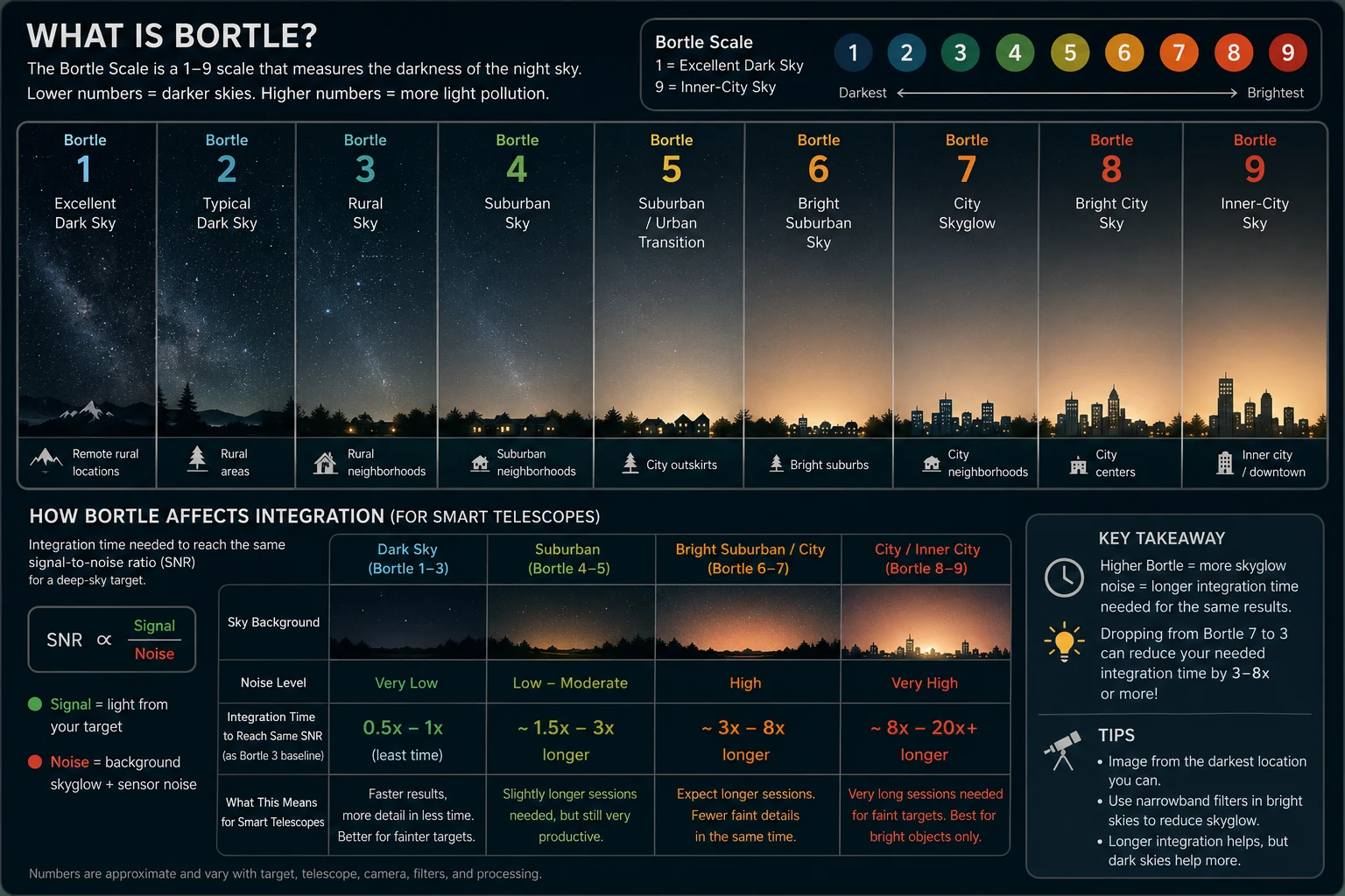
Everyone finds their Bortle number the same way. You type your postcode into a light pollution map, read off the colour, and then quote that number for the rest of your life. Mine comes back as 7, shading towards 8 nearer the centre of Edinburgh, and I’ve repeated it often enough on this site that it may as well be printed on the telescope. The chart above is the version of the scale I keep coming back to — nine classes, and what each one costs you in hours.
What that chart can’t tell you is which column you’re actually in tonight. The number came from a satellite that has never seen my garden, and the distance between the two is where most of the frustration in city astrophotography quietly lives.
Start with what the scale originally was. When John Bortle published it in 2001 it was an observational scale — you placed your sky by what you could see from it. Does the Milky Way show structure or is it a faint smudge? Is the zodiacal light visible in spring? Can you find M33 without optics? How faint a star can you still pick out at the zenith? You went outside, let your eyes adapt for half an hour, and made a judgement. Almost nobody does this now. What we do instead is read a map, and the maps are measuring something else entirely: artificial light escaping upward, recorded by an instrument on a polar-orbiting satellite in pixels around 750 metres across, then pushed through a model that turns it into a sky brightness and finally into a colour that gets read back as a Bortle class. It’s a reasonable proxy. It is not the same measurement, and the places where it comes apart are the places you actually image from.
The most obvious gap is that a satellite only sees light going up. A neighbour’s security light throwing photons sideways across a fence contributes essentially nothing to the view from orbit, and does more damage to a single sub than the entire city’s glow — it’s the one source of light pollution you can usually fix, by parking something solid between it and the telescope. The same blindness works in your favour too: a wall, a hedge or the house itself can shield a garden in a way no map will ever credit you for. Averaged across 750 metres, my street and the retail park down the road share a single number.
There’s a subtler problem with the satellite data as well. The instrument is largely insensitive to blue light, and the sodium lamps that used to light British streets have been steadily replaced by blue-rich white LEDs. Those LEDs scatter more efficiently in the atmosphere than the orange sodium they replaced, so they can make a sky worse while the satellite records it as better. Some maps have been quietly getting greener without the skies underneath them improving at all.
Then there’s the night itself, and this is the part that dwarfs everything above. Skyglow isn’t produced by streetlights alone — it’s produced by streetlights and whatever is in the air to scatter them back down. On a humid night, or one with a haze of aerosols sitting over the city, the same lamps put a substantially brighter sky over your garden than they do on a crisp, dry one. Fresh snow on the ground does the same thing by bouncing light straight back up. And the Moon competes with a city on its own terms: a full Moon puts roughly as much light into the sky as Edinburgh does, and it does it from a Bortle 1 site just as thoroughly. The number on the map is a dry, transparent, moonless average. Most nights are not that night, in either direction.
Direction matters too, and not just in time. At Bortle 7 to 8 the sky isn’t a uniform dome of glow — it’s a gradient, brightest towards the city centre and towards the horizon, where you’re looking through both the most atmosphere and the most streetlights. My northern sky is usably darker than my southern one. Same garden, same night, two different classes depending on where the telescope is pointing. That’s the real reason “shoot high” is such durable advice: a target overhead is sitting in a measurably better sky than the identical target at twenty degrees, and you get that improvement for free.
The useful conclusion isn’t that the maps are wrong. It’s that you already own a better instrument than the satellite. Every calibrated frame you take is a sky brightness reading — the background level in your subs is a direct measurement of what your sky was doing, from your garden, in the direction you were pointing, on that specific night. Watch that number across a few sessions and you learn things a map cannot tell you: that the north is worth an hour the south isn’t, that the damp nights are barely worth opening the case for, that a clear night after rain is the one to spend on a galaxy.
None of this changes the physics on the chart. Skyglow still brings its own noise, signal-to-noise still improves only with the square root of time, and a bright sky still charges you the multiplier — I’ve written up how the scale works and what each class costs properly on its own page. What it changes is what you do with your number. It isn’t a fixed property of where you live, filed once and never revisited. It’s an average, and averages can be beaten on a good night and squandered on a bad one.
The satellite gets one look at Edinburgh, from directly overhead, at about half past one in the morning. You get the whole night, and you get to choose where to point.